Project Overview
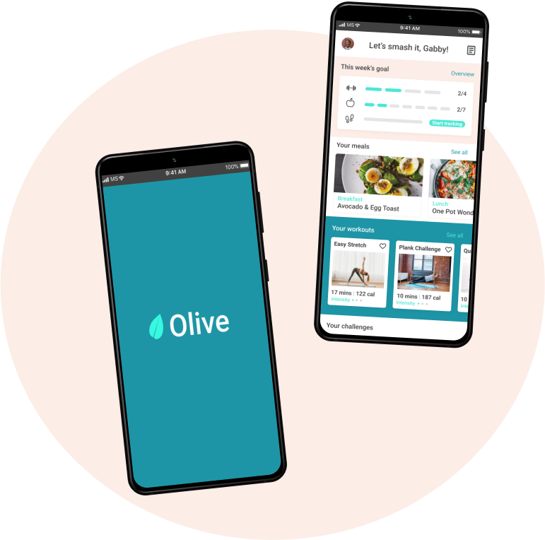
Olive is a one-stop workout and meal planner app designed to help individuals reach their health and fitness goals by providing users with the freedom to personalize and customize their experience and simply adjust more to their individual needs.
Busy? Tired? Lazy? Uninspired? Lost your gym routine after COVID-19? We have probably all been there, but how to get back on track? How might we help people become a healthier, fitter version of themselves? All these questions made me want to go deeper and explore the problem space, find a solution and, ultimately, help people with their fitness needs. After all, we need a healthy, well-nourished body for everything else in life.
This is the story of Olive :)


Olive’s journey began with research. I wanted to identify how current fitness apps are not meeting the needs of users and develop an understanding of them. I conducted a competitive analysis on 2 fitness apps, FitOn and 8fit.
I also interviewed health-conscious individuals who have used fitness apps to uncover attitudes, behaviour, habits, pain points and difficulties on their fitness journey and to see how they compare to what the competitors were offering.




I used affinity mapping to synthesize my research findings and identify insights.
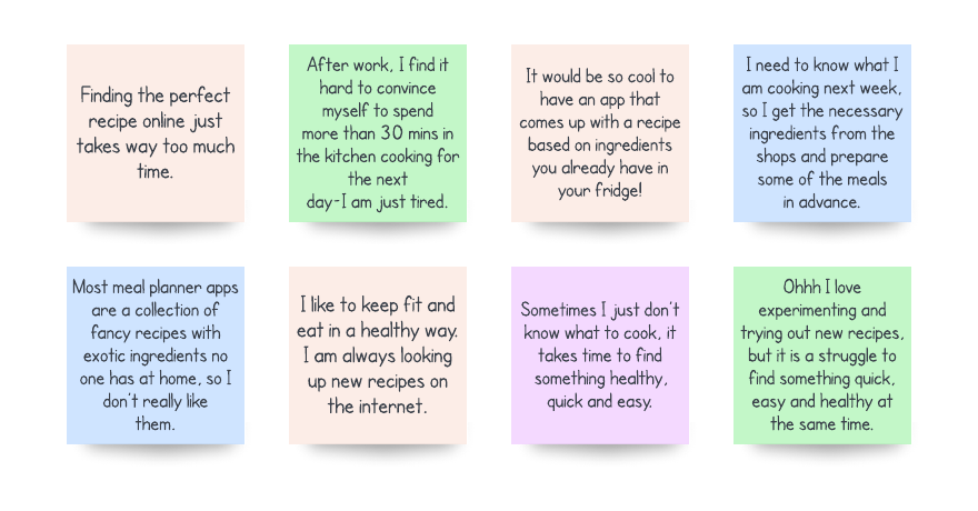
How people felt about meal planning
Problems and needs I found
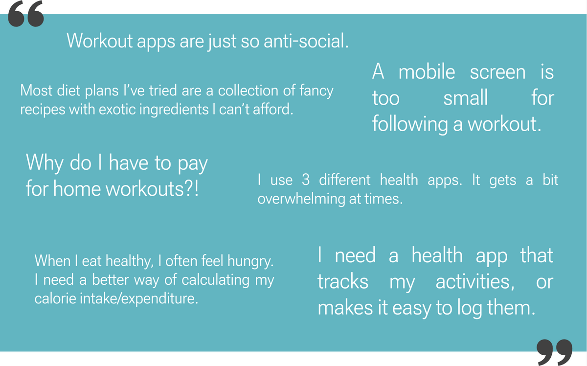
These insights helped me define the problems users were experiencing:
Health-conscious individuals need a simple, cost-effective way of following and managing their fitness goals, an all-in-one app with social, tracking and logging features that can be used/cast on different gadgets and devices, because they feel overwhelmed by following their fitness stats in different apps. They also need a simpler way of managing their diet and nutrition, as current meal planner apps don’t meet their needs.
Personas
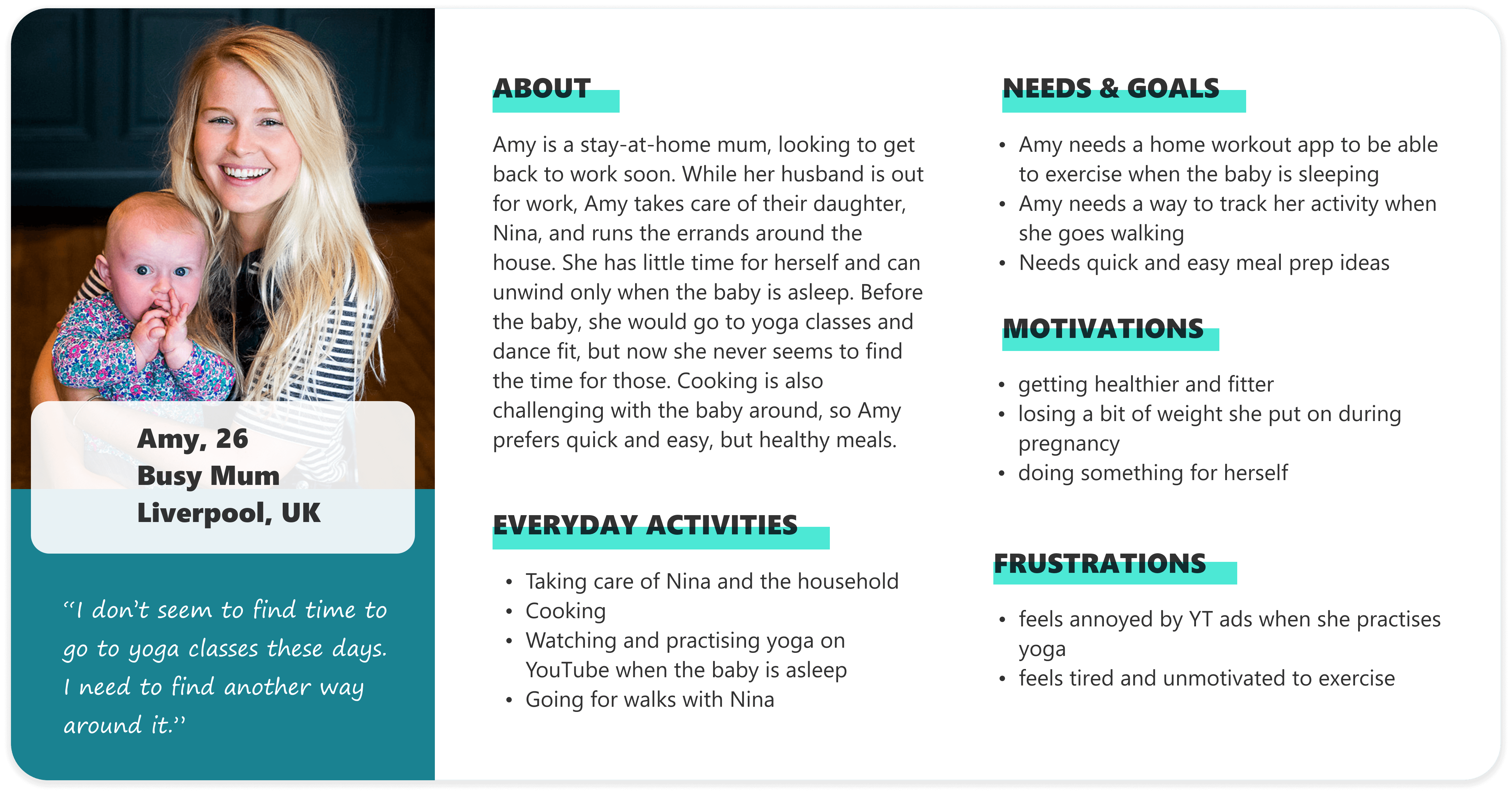
Based on the interview insights, I created user personas. This helped me to further empathize with who I am designing for throughout the design process. Meet Louis and Amy.
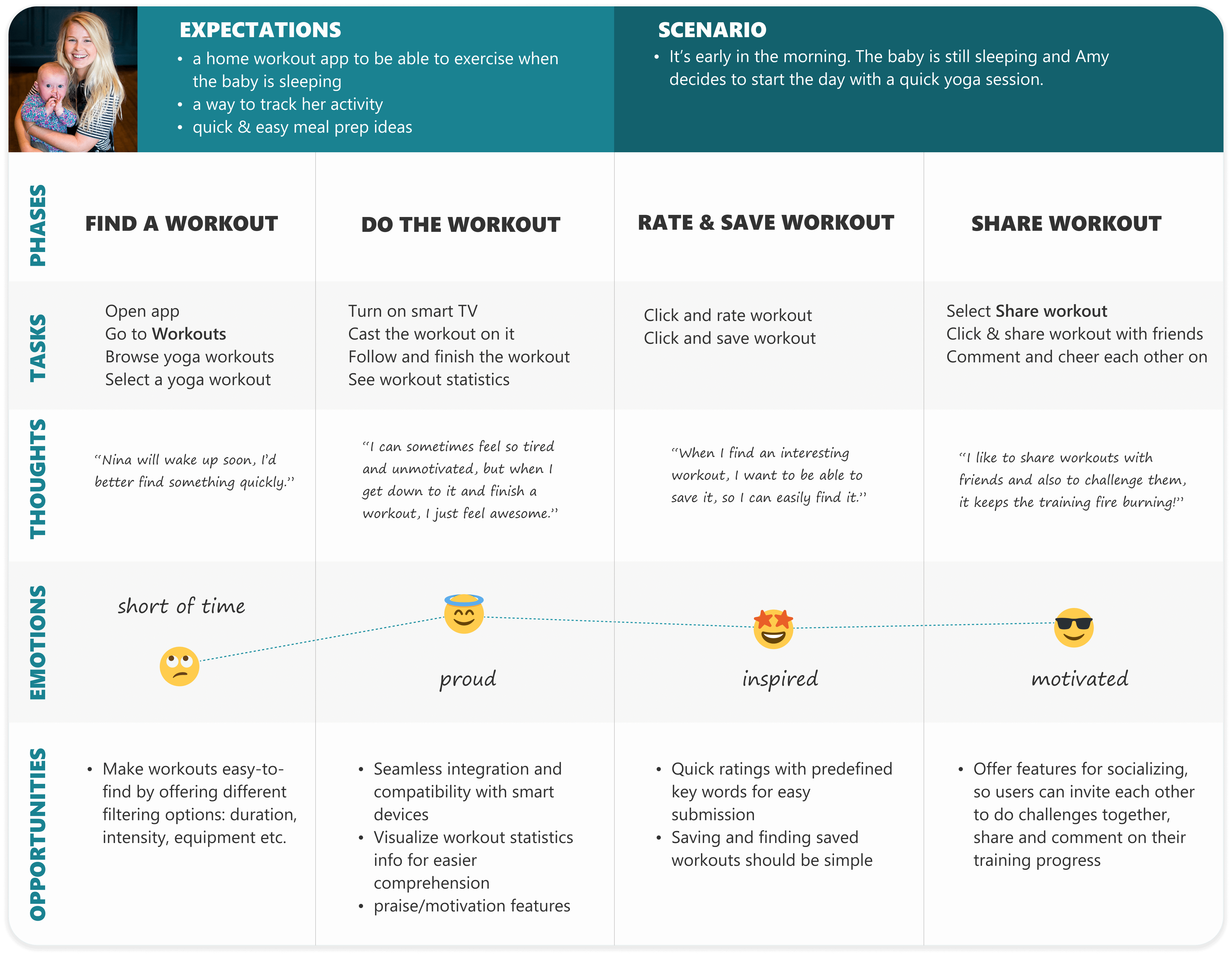
Amy's User Journey
The next step was to map out how Amy feels when completing tasks. This helped me understand where she might be experiencing pain points, confusion and frustration, and also got me started thinking about possible solutions to the identified pain points.


Using my insights from journey mapping, I started ideating solutions to user concerns and created user flows. My main goal here was to create flows that minimize unpleasant emotions and pain points, increasing user satisfaction and task completion.
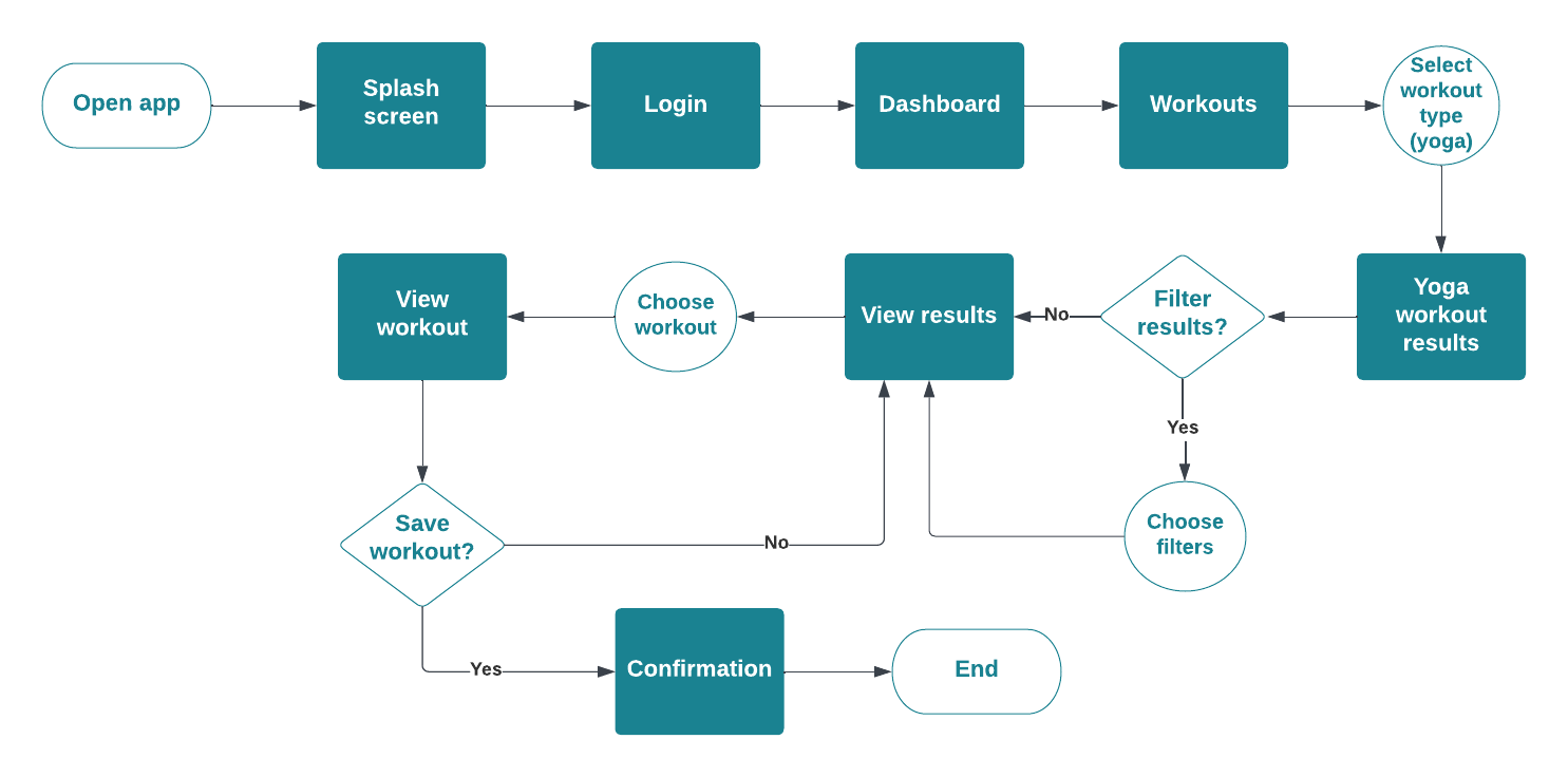
"As a busy, but health-conscious person, I want to be able to save workouts that I like, so that I can easily find them when I need them." -Amy


After identifying potential solutions for user tasks , Olive was finally ready to come to life! :) At first, I drew simple sketches with basic functionality to focus more on layout and navigation, rather than details and additional features.
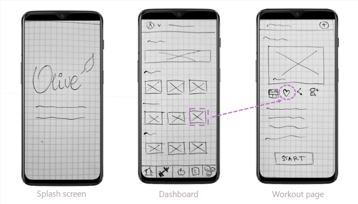
Low-fidelity sketch of Flow #3: Saving a yoga workout
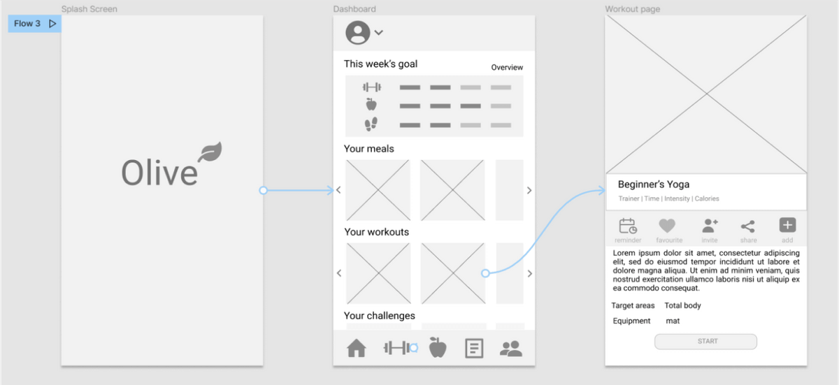
I expanded on my design with mid-fidelity wireframes by adding more detail to the screens using Figma:
There was only one question left...does this solution actually work for our users?
Let's test it!


Before diving deep down into high-fidelity solutions, I wanted to evaluate how effectively users can complete tasks using the mid-fidelity prototype. I conducted a usability test with the following objectives:
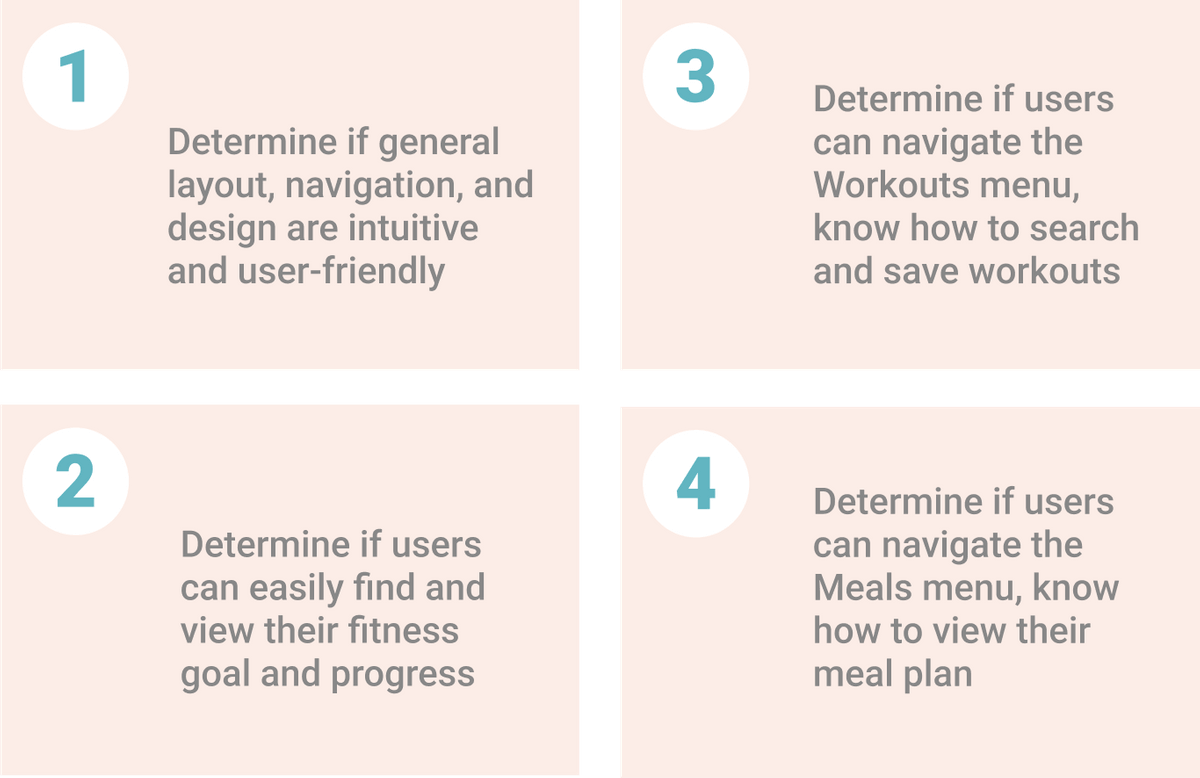
Click here for a detailed usability test plan and report.
Usability Test Results
I used Nielsen’s usability severity rating scale to assess and prioritize usability concerns, as well as a Single Ease Question (SEQ) scale to rate task difficulty as perceived by test participants. Test results were then organized into an affinity map and a more detailed rainbow spreadsheet.
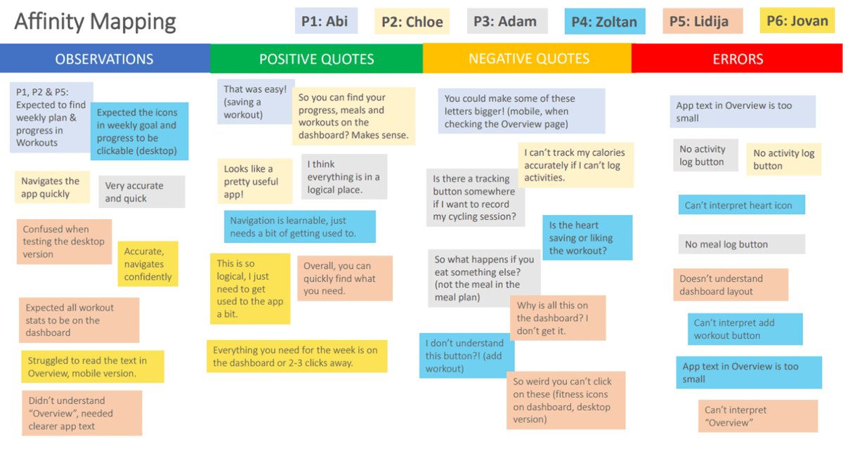
Key Findings & Implemented Solutions
2/6 struggled reading app text in the Overview section.
Outcome: App text was increased to 14-16 px, where and as appropriate.
2/6 no option to log activities outside the app.
Outcome: A logging feature was created to address the issue.
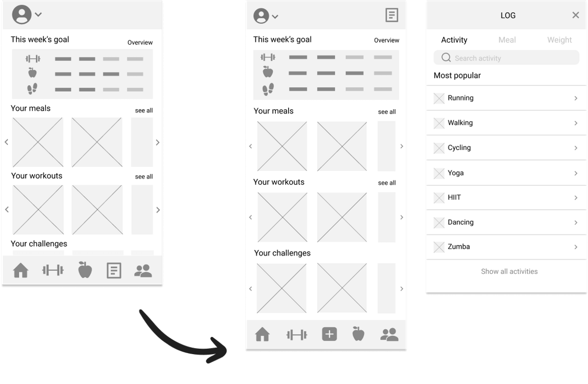
A logging feature was added to the tab bar so users can quickly find and log their activities.
3/6 expected to find weekly goal and progress in Workouts.
Outcome: Made the weight icon in Workouts clickable, opening up stats.
2/6 no option to log meals outside the app.
Outcome: A meal logging feature was created to address the issue.


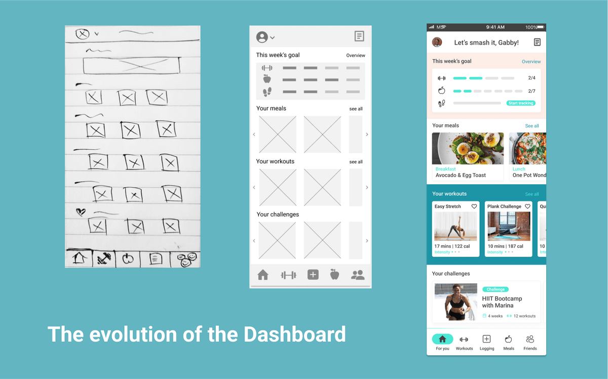
Now that the most important usability issues had been addressed, it was time to create high-fidelity prototypes and refine the design. As I was designing for Android, I refined the design according to M3 guidelines. I also reached out to my UX/UI network for feedback and implemented further iterations.
Accessibility
It was at this point that I had also addressed accessibility issues to improve app text legibility, error messages and issues with placeholders.
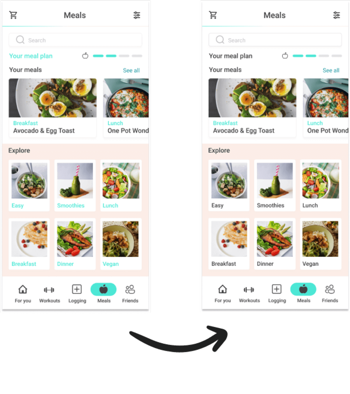
Text and shape colour changed to improve legibility
Design Language System
To maintain visual consistency and communicate Olive’s brand identity and values, I created a design language system.

This is Olive :)
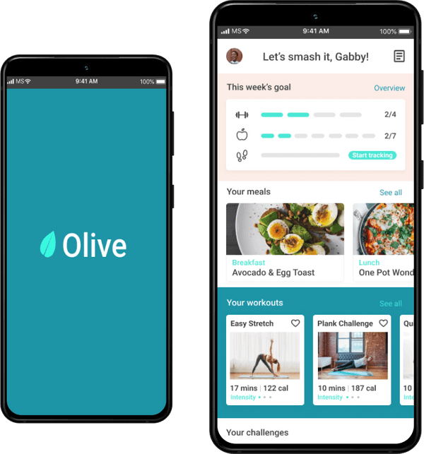
Interact with Prototype
Ready to see Olive in action? Just click here to interact with the prototype in Figma. You can explore the following tasks, based on our user personas:
- Sign up/Login
- View fitness goal
- Save a workout
- View meal plan
Thanks so much for reading :)